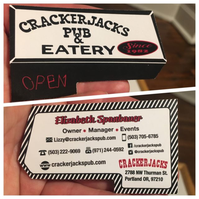
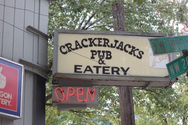
Crackerjacks specifically wanted their logo to represent the sign that has lighted the corner of 28th and NW Thurman, outside the Pub, since 1982. Steering from popular design rules, this logo was intentionally made to look classic and “rough and tumble,” illustrating the scrappy, trusty, neighborhood dive persona of the establishment.
V.2
![]()
V.1
![]()
I created these diecut business cards to fit in the perimeter of a standard business card so that they will work with regular card holders while remaining unique.